top of page
मीनू अन्ना मैथ्यू
मीनू अन्ना मैथ्यू
पलक्कड़, केरल
2022
प्रतिक्रियात्मक वेब डिज़ाइन
What is CoachPro?
CoachPro is India's first ever business management platform specifically tailored to fitness trainers, which simultaneously solves the three-party problem between Trainer - Client - Brand.
My role
I was involved in the research and design, where I worked around tight deadlines and guided a junior designer on workings of the software, design processes and their implementation; for both Design and its effects on Dev.
I included short usability tests to understand where the UX was lacking and required to be improved. As the senior designer on the project I worked on Dev handoffs with a team of 2 Developers and 1 designer, I implemented a Scrum board with colour coding to keep the project on track.

The Problems
Mapping the Journey
To understand and improve the product, I spoke to the product owner but the insight was not very pointed. So, I conducted an audit on the existing product and found UX writing discrepancies which made the product harder to understand. The lack of a flow within the onboarding pattern and inconsistency in UI also created confusion while working with the product. This was reconfirmed by brief user tests and the value of the product was unclear.
To ease the friction between the users and the portal I reworked on their UX along with the junior designer and product owner in a sprint session. Here, we removed unnecessary and repetitive parts of the flow and carved a clearer flow, similar to what the user would write offline.
Used a Word document for Sprint Session as it was easier for the PO. Also added bulk upload members via CSV and sample files to add details.
Bench Marking
After going through the initial benchmarking done by the other designers, I found that the website was copied by the Devs to be an exact replica of another website, so I went through the portals of both direct and indirect competitors to analyse their strengths and weaknesses.


Design Sprints
Due to the shorter duration of the project I ran a Design Sprint with the PO and designer to rework the project objectives and set a design process for quick implementation. Here we worked out the HMW's for the project and then re-enforced the brand identity to integrate the existing identity into their digital platform.
Redefined User Problems
"Enable the user to onboard a client with the least amount of redirection and create the a faster processes of updating the details."
-
Decrease the completion time
-
Reduce the requirement for help and support
-
Increase profits and market shares
The Solutions
Mapping an easier onboarding process
For the MVP, we decided to target a first time user (trainer) adding his first client. I made a preliminary Information Architecture which cut out repetition by clubbing similar artefacts under broader categorisation as the current flow made it difficult to keep track of next steps. Then I discussed it with the PO and Developers to make sure it would be feasible. The Information Architecture was changed from :

Dashboard
Subscriptions
Club Batches
Invoices
Workout
Plans
Members
Users
Payments
To :

Dashboard
Workout
Members
Payments
Affiliate
Marketing
Re-thinking the Design System and Writing
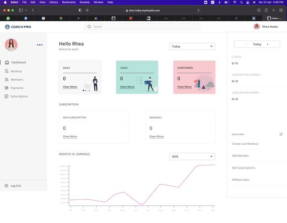
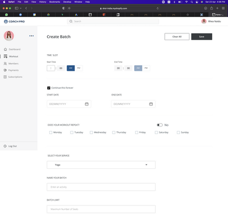
Keeping in mind basic UI elements and their interactions, a Design System was created to support the platform and its users with Auto Layout and Components this helped in reinforcing the Law of Uniform Connectedness. UX writing throughout the system was standardised as well.

Transforming the platform from what it was (above) to a simpler space (below)

Results and Takeaways
Onboarding processes were cut down by half the time they usually take by the user by working with Miller's Law, which lead to a significant increase in the number of users on the platform.
Tips were placed to guide users in case of confusion, thus decreasing the number of people required for help and support, reducing number of people required in the process.
What I have learned
- Reworking traditional design sprints to suit the requirements of the people involved.
- Mentoring a new designer to aid in implementing design processes.
- Creating a language and Design system from scratch.
Glimpses of the Project

bottom of page


